In today’s data-driven business landscape, organizations are drowning in information but starving for insights. As the volume and complexity of data continue to grow exponentially, the ability to transform raw numbers into actionable intelligence has become a critical competitive advantage.
Data visualization stands at the forefront of this transformation, offering powerful tools to enhance decision-making processes across industries.
Understanding Data Visualization in Modern Business
Data visualization is the graphical representation of information and data using visual elements like charts, graphs, and maps. What began as simple bar charts and pie diagrams has evolved into interactive dashboards and immersive visual experiences that reveal patterns, correlations, and trends that might otherwise remain buried in spreadsheets.
According to research from MIT, the human brain processes visual information 60,000 times faster than text.
This cognitive advantage explains why well-designed visualizations can dramatically accelerate understanding and decision-making in complex scenarios. In an era where time-to-decision directly impacts business outcomes, visualization has become essential rather than optional.
The Cognitive Impact of Visual Data Processing
Our brains are wired to process visual information more efficiently than text or numbers. This phenomenon, known as “preattentive processing,” allows us to grasp certain visual attributes — color, size, shape, and motion — almost instantaneously, without conscious effort.
Studies have consistently shown that people remember only about 10% of what they hear and 20% of what they read, but nearly 80% of what they see and do.
By leveraging this cognitive advantage, data visualization reduces the mental workload required to process complex information, allowing decision-makers to:
- Quickly identify patterns and anomalies
- Understand relationships between variables
- Retain insights longer and more accurately
- Share a common understanding across teams
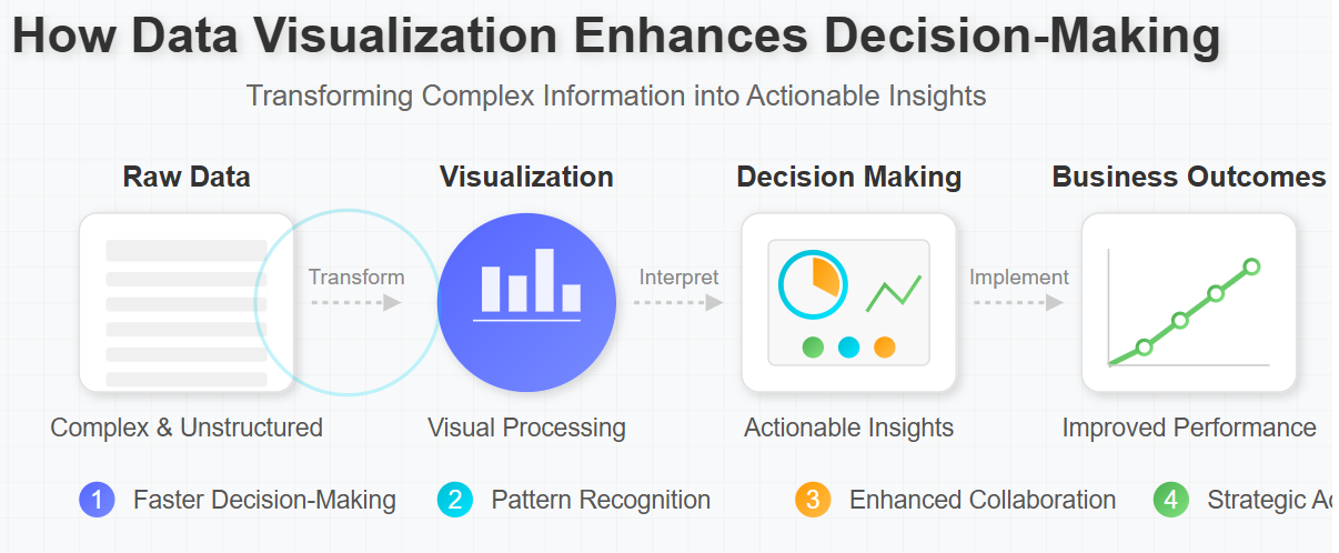
How Visualization Transforms Decision-Making Processes

Accelerating Time-to-Decision
In competitive business environments, the speed of decision-making can be as important as the quality. Visualization dramatically reduces the time required to analyze and understand complex data sets.
For example, a global manufacturing company implemented real-time production dashboards across its facilities and reduced decision response time by 58%.
When quality issues appeared on the visualization, floor managers could immediately identify and address problems rather than waiting for end-of-day reports.
“Before implementing visualization tools, our weekly analysis meetings would last three hours as we pored over spreadsheets,” explains Sarah Chen, Chief Data Officer at a Fortune 500 financial services firm. “Now, with our interactive dashboards, we identify key insights in under 30 minutes and spend the rest of our time on strategic decisions rather than data interpretation.”
Discover -> Bad Data Visualization Examples
Enhancing Focus on Critical Insights
The human attention span is limited, making focus a precious commodity. Well-designed visualizations focus on what matters most, filtering out noise and highlighting significant patterns.
Consider healthcare settings, where patient monitoring generates enormous volumes of data. Visualization tools that highlight vital sign anomalies enable clinicians to identify patients requiring immediate attention quickly.
One hospital system reported a 23% improvement in early intervention after implementing visualization-based monitoring, directly improving patient outcomes.
Uncovering Hidden Patterns and Relationships
Some insights simply cannot be discovered without visualization. Complex relationships between variables often remain invisible in traditional reports but become immediately apparent when visualized effectively.
A retail chain analyzing customer behavior discovered an unexpected correlation between weather patterns and certain product categories only after visualizing their sales data geospatially.
This insight led to a dynamic inventory management system that increased seasonal product availability by 34% while reducing overstock by 27%.
Improving Collaborative Decision-Making
When teams share visualizations, they develop a common understanding that transcends departments and technical expertise.
Marketing teams can understand supply chain constraints; finance can appreciate customer experience metrics; executives can grasp technical challenges — all through the universal language of visual representation.
Real-World Applications Across Industries
Financial Services: Risk Visualization and Fraud Detection
Financial institutions handle massive data volumes while operating in highly regulated environments where risks must be carefully managed. Interactive heat maps and network visualizations help analysts quickly identify suspicious patterns that might indicate fraud.
JPMorgan Chase’s fraud detection systems reportedly process 5 million transactions daily, using visualization to highlight potential fraud patterns that would be impossible to detect manually. Their visualization-powered systems have improved fraud detection rates by over 30% while reducing false positives.
Healthcare: Improving Patient Outcomes Through Visual Analytics
Healthcare providers increasingly rely on visualization to manage patient populations and improve clinical outcomes. Visualizing patient data across demographics, conditions, and treatments helps identify high-risk patients and optimize care protocols.
Cleveland Clinic implemented visualization dashboards to monitor readmission risk factors, resulting in a 21% reduction in preventable readmissions.
Clinicians could visually identify which post-discharge interventions were most effective for specific patient populations, allowing for more personalized care planning.
Marketing: Customer Journey Visualization
Modern marketing generates vast data across multiple touchpoints. Visualization tools help marketers understand the complex customer journey and identify opportunities for engagement.
An e-commerce company used journey visualization to discover that customers who engaged with their mobile app within three days of website browsing were 67% more likely to complete a purchase.
This insight led to targeted app download prompts that increased conversion rates by 24%.
Discover -> Worth Investing In Data Visualization Tools For SMEs
Avoiding Common Visualization Pitfalls
Despite its power, data visualization can mislead when implemented poorly. Common pitfalls include:
- Misleading scales and proportions: Manipulating axis scales can dramatically change perceptions
- Correlation confusion: Visualization might suggest causation where only correlation exists
- Overcomplication: Adding too many variables to a single visualization reduces clarity
- Cherry-picking data: Selecting only data points that support a preferred narrative
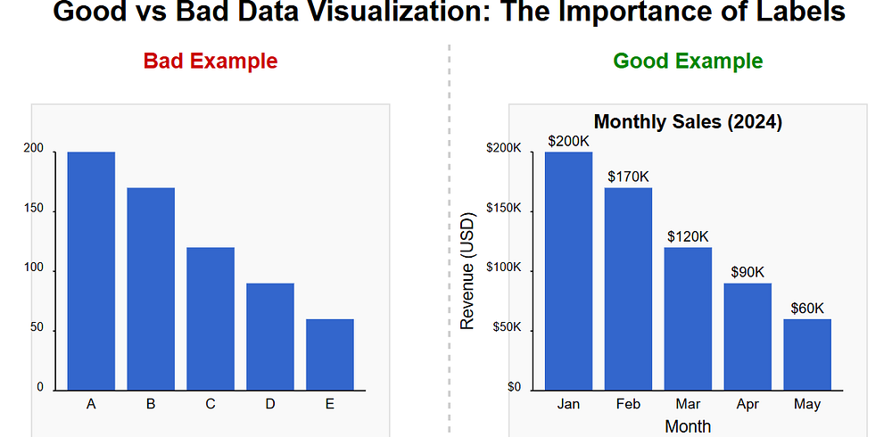
To maintain integrity, organizations should establish visualization standards and train teams in visual literacy — the ability to read, interpret, and create visual representations of data.
The Future of Decision-Making Through Visualization
As technology advances, visualization continues to evolve. Emerging trends include:
- Augmented analytics: AI-powered systems that automatically identify and highlight noteworthy patterns
- Immersive visualization: VR/AR environments where users can “walk through” their data
- Natural language interfaces: Systems that generate visualizations in response to conversational queries
- Real-time, collaborative visualization: Platforms that enable multiple stakeholders to interact with live data simultaneously
Conclusion: Translating Visual Insights into Action
Data visualization’s true value lies not in creating beautiful graphics but in driving better decisions. Organizations that develop a visualization strategy aligned with their decision-making needs gain a significant competitive edge.
By reducing cognitive load, highlighting critical insights, uncovering hidden patterns, and fostering collaboration, data visualization transforms information overload into decision-making clarity.
In a business environment where the quality and speed of decisions directly impact success, the ability to effectively visualize data has become an essential capability rather than a nice-to-have skill.
As you consider your organization’s approach to data, remember that the most sophisticated analysis provides little value if key decision-makers cannot understand and act upon it. Effective visualization bridges this gap, ensuring that your data doesn’t just inform — it transforms.